The Evolution of Typography: From Print to Digital Bold Text
Trace the fascinating journey of bold text from traditional print media to modern digital applications and future trends.
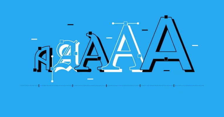
Typography has evolved dramatically over the centuries, from hand-carved letters to digital fonts. Understanding this evolution helps us appreciate the profound impact that bold text and font weight variations have had on human communication and design.
The Ancient Origins of Typography
Early Writing Systems and Emphasis
The concept of emphasizing text through visual weight dates back to ancient civilizations, long before the invention of movable type.
Ancient Egyptian Hieroglyphs (3200 BCE)
- Used size variations to indicate importance
- Larger hieroglyphs represented gods and pharaohs
- Color and material choices (gold, precious stones) added emphasis
- Established the principle that visual weight equals importance
Roman Inscriptions (753 BCE - 476 CE)
- Developed the foundation of Western letterforms
- Used varying depths in stone carving for emphasis
- Created the basis for serif typography
- Established proportional relationships still used today
Medieval Manuscripts (5th - 15th Century)
- Illuminated letters served as early "bold" text
- Drop caps and decorative initials drew attention
- Different ink colors and gold leaf created hierarchy
- Scribes developed consistent letter spacing and sizing
The Birth of Movable Type
Gutenberg's Revolution (1440) Johannes Gutenberg's printing press fundamentally changed typography:
- Standardization: Consistent letterforms across multiple copies
- Efficiency: Mass production of text became possible
- Accessibility: Books became more affordable and widespread
- Innovation: Led to experimentation with different type styles
Early Type Families The first printers quickly recognized the need for emphasis:
- Blackletter (Gothic): Heavy, bold appearance by default
- Roman types: Lighter weight, required separate bold versions
- Italic types: Initially used for emphasis, later for style
- Display types: Larger, bolder fonts for headlines and titles
The Industrial Revolution and Typography
Mechanization of Type Production
19th Century Innovations:
1. Pantograph Systems (1834)
- Allowed scaling of letterforms to different sizes
- Maintained proportional relationships
- Enabled creation of type families with multiple weights
- Reduced cost and time of font production
2. Hot Metal Typesetting
- Linotype (1886): Revolutionized newspaper production
- Monotype (1893): Allowed individual character casting
- Enabled rapid production of bold and italic variants
- Standardized point system for measuring type sizes
3. Phototypesetting (1950s)
- Used light to expose letterforms onto photographic paper
- Allowed infinite scaling without quality loss
- Enabled easy creation of condensed and expanded versions
- Reduced physical storage requirements for fonts
The Rise of Sans Serif Typography
Bauhaus Movement (1919-1933) The Bauhaus school revolutionized typography with principles that still influence bold text design:
Key Principles:
- Function over decoration: Clean, readable letterforms
- Geometric construction: Based on simple shapes and proportions
- Universal design: Typography that works across cultures
- Systematic approach: Consistent rules for type families
Influential Typefaces:
- Futura (1927): Geometric sans serif with multiple weights
- Helvetica (1957): Neutral, highly legible in all weights
- Univers (1957): First systematic type family with numbered weights
- Frutiger (1976): Humanist sans serif optimized for signage
The Digital Revolution
Early Computer Typography (1960s-1980s)
Bitmap Fonts
- Pixels arranged in grids to form letters
- Limited to specific sizes and resolutions
- Bold versions required separate bitmap files
- Challenged designers to work within technical constraints
Vector Fonts
- Mathematical descriptions of letterforms
- Scalable to any size without quality loss
- Enabled smooth weight interpolation
- Foundation for modern digital typography
Desktop Publishing Revolution (1980s)
Key Developments:
1. PostScript (1982)
- Adobe's page description language
- Enabled high-quality font rendering
- Supported multiple weights and styles
- Standardized font formats across platforms
2. TrueType (1991)
- Apple and Microsoft's font format
- Built-in hinting for better screen display
- Simplified font installation and management
- Made typography accessible to non-professionals
3. Desktop Publishing Software
- PageMaker (1985): First consumer DTP application
- QuarkXPress (1987): Professional layout and typography
- Adobe InDesign (1999): Advanced typography controls
- Democratized professional typography and design
Web Typography Evolution
Early Web Constraints (1990s)
- Limited to system fonts (Arial, Times, Courier)
- No control over font weights or advanced typography
- Text as images for custom fonts
- Accessibility and SEO challenges with image text
CSS Typography Advances
CSS1 (1996)
- Basic font-family, size, and weight properties
- Limited to normal and bold weights
- Browser-dependent font rendering
- Foundation for web typography standards
CSS2 (1998)
- Introduced font-weight numeric values (100-900)
- Better control over text styling
- Support for font-style and font-variant
- Improved cross-browser compatibility
CSS3 and Beyond (2000s-present)
- @font-face: Custom web fonts
- font-weight: Precise weight control
- font-variation-settings: Variable font support
- text-rendering: Optimized font display
Web Font Services Revolution
Google Fonts (2010)
- Free, open-source web fonts
- Easy integration with websites
- Extensive weight and style options
- Global CDN for fast loading
Adobe Fonts (formerly Typekit, 2009)
- Professional font library
- Subscription-based model
- High-quality typefaces from major foundries
- Desktop and web font synchronization
Font Squirrel (2009)
- Free commercial-use fonts
- Web font generator tools
- Curated collection of quality typefaces
- Educational resources for web typography
Modern Typography Technologies
Variable Fonts
OpenType Variable Fonts (2016) A revolutionary advancement in font technology:
Technical Capabilities:
- Weight axis: Continuous weight variation from thin to black
- Width axis: Condensed to extended in infinite steps
- Optical size: Optimized for different text sizes
- Custom axes: Unique variations designed by type designers
Advantages:
- File size efficiency: One file contains multiple styles
- Design flexibility: Infinite weight and style combinations
- Performance: Faster loading and rendering
- Responsive typography: Adapts to screen size and context
Popular Variable Fonts:
- Inter: Designed specifically for user interfaces
- Source Sans Variable: Adobe's open-source family
- Recursive: Monospace to sans serif spectrum
- Amstelvar: Experimental multi-axis typeface
AI and Machine Learning in Typography
Automated Font Generation
- DeepFont: AI system for font recognition and classification
- FontJoy: Machine learning-powered font pairing
- Prototypo: Parametric font design tools
- Glyphs AI: Intelligent glyph generation and spacing
Personalized Typography
- User behavior analysis for optimal font choices
- Dynamic weight adjustment based on reading conditions
- Accessibility-driven font modifications
- Cultural and linguistic typography optimization
Contemporary Typography Trends
Minimalism and Clarity
Characteristics:
- Simplified letterforms: Reduced visual noise
- Generous spacing: Improved readability
- Subtle weight variations: Refined hierarchy
- Neutral aesthetics: Timeless, versatile design
Examples:
- SF Pro (Apple): System font with excellent weight range
- Roboto (Google): Android's default with multiple weights
- Segoe UI (Microsoft): Windows system font family
- Inter (Figma): UI-optimized variable font
Expressive and Experimental Typography
Characteristics:
- Extreme weight contrasts: Ultra-thin to ultra-black
- Unconventional proportions: Challenging traditional rules
- Mixed styles: Combining serif and sans serif elements
- Cultural influences: Typography reflecting global diversity
Applications:
- Brand identity: Distinctive, memorable typefaces
- Editorial design: Attention-grabbing headlines
- Digital art: Typography as visual expression
- Social media: Bold, shareable text graphics
Accessibility-First Design
Principles:
- High contrast: Ensuring readability for visually impaired users
- Dyslexia-friendly: Fonts designed for reading difficulties
- Multilingual support: Comprehensive character sets
- Responsive scaling: Maintaining readability at all sizes
Notable Accessible Fonts:
- Atkinson Hyperlegible: Designed by Braille Institute
- OpenDyslexic: Specifically for dyslexic readers
- Lexend: Scientifically proven to improve reading proficiency
- Noto: Google's universal font family
The Future of Typography
Emerging Technologies
Augmented Reality (AR) Typography
- Spatial text: 3D typography in physical spaces
- Context-aware fonts: Adapting to environmental conditions
- Interactive letterforms: Responding to user gestures
- Mixed reality interfaces: Seamless digital-physical integration
Virtual Reality (VR) Typography
- Immersive text experiences: Typography in 3D environments
- Depth-based hierarchy: Using Z-axis for emphasis
- Comfort optimization: Reducing eye strain in VR
- Spatial reading patterns: New approaches to text layout
Voice and Audio Typography
- Sonic branding: Audio representations of fonts
- Screen reader optimization: Better text-to-speech integration
- Voice-controlled typography: Hands-free text formatting
- Audio-visual synchronization: Coordinated sound and text
Artificial Intelligence Integration
Predictive Typography
- Context-aware font selection: AI choosing optimal fonts
- Real-time optimization: Adjusting typography based on user behavior
- Emotional typography: Fonts that respond to content sentiment
- Performance prediction: AI forecasting typography effectiveness
Generative Typography
- Custom font creation: AI generating unique typefaces
- Style transfer: Applying typographic styles across fonts
- Automatic pairing: AI-powered font combination suggestions
- Cultural adaptation: Fonts optimized for specific audiences
Sustainability in Typography
Environmental Considerations
- Ink-efficient fonts: Reducing printing costs and waste
- Energy-optimized rendering: Lower power consumption for displays
- Sustainable font production: Eco-friendly design processes
- Digital-first typography: Reducing reliance on physical materials
Examples:
- Ecofont: Holes in letters reduce ink usage by 15%
- Ryman Eco: Designed to save ink while maintaining readability
- Century Gothic: Naturally ink-efficient sans serif
- Garamond: Classic serif that uses less ink than Times New Roman
Cultural and Global Typography
Inclusive Design
- Multi-script harmony: Fonts supporting multiple writing systems
- Cultural sensitivity: Typography respecting local traditions
- Gender-neutral design: Avoiding culturally biased letterforms
- Indigenous typography: Preserving and celebrating native scripts
Global Standardization
- Unicode expansion: Supporting more languages and symbols
- Cross-platform consistency: Unified typography across devices
- International accessibility: Global standards for readable typography
- Cultural exchange: Typography facilitating cross-cultural communication
Practical Applications for Modern Designers
Choosing the Right Font Weight
Content Hierarchy Guidelines:
- Headlines: 600-800 weight for maximum impact
- Subheadings: 500-600 weight for clear distinction
- Body text: 400 weight for optimal readability
- Captions: 300-400 weight for subtle information
Platform Considerations:
- Print: Higher contrast weights work well
- Web: Medium weights often render better on screens
- Mobile: Slightly heavier weights improve small-screen readability
- Signage: Bold weights ensure visibility from distance
Future-Proofing Typography Choices
Technical Considerations:
- Variable font support: Choosing fonts with future flexibility
- Performance optimization: Balancing quality with loading speed
- Accessibility compliance: Meeting current and future standards
- Cross-platform compatibility: Ensuring consistent rendering
Design Strategy:
- Modular typography systems: Scalable and maintainable approaches
- Brand consistency: Typography that evolves with brand identity
- User-centered design: Prioritizing reader experience
- Continuous optimization: Regular testing and refinement
The evolution of typography from ancient stone carvings to AI-powered variable fonts represents humanity's ongoing quest to communicate more effectively. As we move forward, the principles of good typography—clarity, hierarchy, and accessibility—remain constant, while the tools and technologies continue to expand our creative possibilities. Understanding this rich history helps designers make informed decisions about bold text and font weight, ensuring that their typography choices serve both aesthetic and functional purposes in our increasingly digital world.